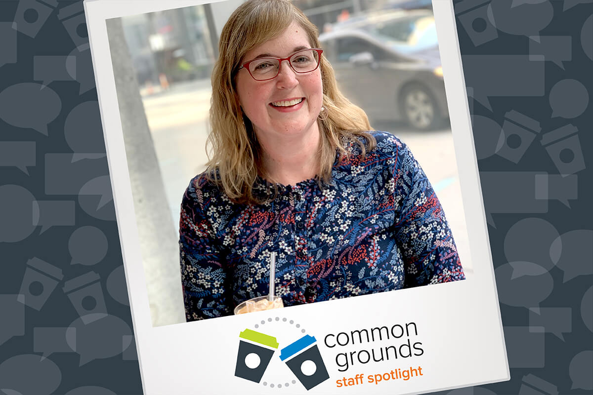
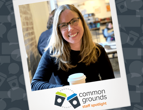
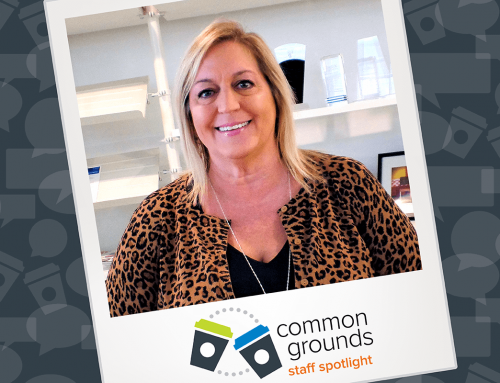
For this month’s installment of Common Grounds, I met up with Vehr’s creative director, Grace Ring. In the spirit of design, we took a trip to Fausto at the Contemporary Art Center, where Grace spilled the (coffee) beans on what goes into Vehr’s creative magic. Spoiler: it involves Tim Gunn.
Thanks for meeting with me Grace, can you tell me a little bit about your role as the creative director at Vehr?
Absolutely, Max. I am the creative director at Vehr, meaning I oversee our design team, manage our creative process and production schedule. In addition to art direction and design work, I often contribute to brand and website audits and am also involved in our marketing and new business efforts.
You mentioned managing the creative process, what does that look like?
It’s a very strategic approach. We don’t immediately jump onto the computer to create layouts. After receiving a brief, we go through a concepting period to develop potential solutions. That usually involves research, brainstorming and sketching — often with pencil on paper.
From there we meet with our account team, look over our ideas and identify the strongest concepts. During that meeting, we may reorganize ideas and combine our concepts to make the strongest ideas possible. It is only then that we jump onto the computer and create the layouts that will be presented to our clients.
Is there any part of the creative process that stands out for you?
An important component of our creative process is the time spent concepting before creating layouts.
If we jump straight onto the computer, we are already thinking about how to execute what is in our heads, and we might spend several hours working through the technical aspects of trying to create that perfect logo or advertisement on the computer.
But with concept sketching, we’re just jotting the idea down on paper. We’re not worrying about how to create it, where to find the perfect image or what color palette to use. It allows us to develop more ideas more quickly and exercise more creative freedom than if we went straight to the computer.
Have you noticed any misconceptions about design work in this industry?
There is a tendency to see design as purely executional work and merely a way of making things look nice. But really, designers at their core are creative problem solvers. At Vehr, design is integrated into the process at a very early stage.
In addition to developing the aesthetics of how something looks, we are applying design thinking to problems, helping to shape content and address client concerns. The design is, in many ways, an extension of the strategy itself.
Are there any principles or mottos that drive your work?
I have a framed embroidery on my desk of Tim Gunn’s saying, “Make it work.”
(Laughs) But seriously, I never want to turn down a project, even if it’s totally outside our comfort zone. Whether a project requires us to rearrange our schedule, bring in additional partners or learn something new, I want our design team to be a resource for our clients to accomplish everything they need.
Speaking of “making it work,” are there any projects you can share with us that you’ve particularly enjoyed?
One of my favorite projects was our recruitment campaign work for Convergys.
Convergys managed customer support teams for some of the world’s foremost brands and wanted our help to recruit employees for its Nike call center. For the first time, Nike allowed Convergys to use their infamous swoosh to co-brand the advertisements. So we didn’t just create a campaign for the Convergys brand, we created a campaign that emulated the look and feel of Nike in order to increase recruitment interest.
The Nike campaign was so successful that we were asked to design similar projects for Convergys’s Apple and Sam’s Club call centers – they were fun opportunities to create strategic, co-branded campaigns for well-known brands and get playful with the design.
Are you keeping your eye on any emerging trends and tools for designers?
I had quite a bit to say about upcoming trends in my recent blog post, but when it comes to technology, I have been playing around a lot with the iPad Pro and Apple Pencil. The apps that are available for it are still developing, but the full version of Photoshop was released around Christmas for the iPad. I’m excited for the full version of Illustrator that they’ve promised, because using a pencil for vector illustrations has the potential to give us so much more control. I’ve gotten pretty good at drawing vector images with a mouse, but it’s certainly not ideal.
Do you think we’re going to continue to see this shift of design technology attempting to emulate pen and paper?
I do, and I think paper is becoming more of a premium item. So, in a sense this is almost a green alternative to conventional pen and paper.
The Apple Pencil really mimics the feel of a graphite pencil. Even better, you can switch it out to react as a marker or as a paintbrush and the device will react accordingly in the feedback it gives the user. It’s pressure-sensitive and reacts to the orientation of how you hold it — so I can even hold it on its side to shade things in, and it will respond realistically.
My only hang-up is that I miss the feel of paper and the resistance you feel between paper and your pencil. But it sure is nice not having to deal with graphite all over my hand (laughs).
As we wrap up, I’ve got to ask about your coffee habits. What’s your go-to?
I’m not a coffee snob, but I do like my coffee. For my morning coffee, I always grind the beans fresh at home. Right now, my favorite coffee is the French Roast from Zingerman’s Deli in Ann Arbor — but you can buy it locally at Jungle Jim’s. It may not be the cheapest (I save it for special occasions), but I promise you can taste the difference.
But that’s not what you’re drinking today …
(Laughs) Well no, with your encouragement, I tried the Maplewood Cold Brew here at Fausto. It’s something totally different but it’s absolutely amazing. I will come back here for coffee for sure – especially if I can sit by this window again.
