In the past year, Stranger Things became the most watched series on Netflix. Crop tops came back. Weezer released the Teal Album. Mr. Rogers was the subject of two successful films. Need I go on? Our sentimentality for the 80s has become a cultural phenomenon.
This nostalgia is influencing design trends for 2020 in a big way. The New Wave aesthetic has been revived and is being employed throughout brand identities, advertisements, social media and packaging. However, designers aren’t going full-blown 80s, but rather using elements of New Wave art in combination with the current minimalist/industrial aesthetic (which has been especially prevalent in interior design with the use of subway tiles, concrete surfaces and black fixtures). Not sure what all this means in terms of branding and advertising? Let’s break it down:
Color
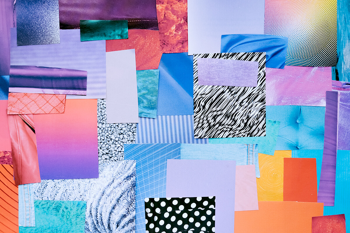
The soft pastels of the 80s are dominating design (as evident with the iPhone 11 offerings), contrasted by somber neutrals and blues, and accented by shiny metallics. Soft greens are especially having a moment, due in no small part to the sustainability movement.
Many of the paint companies have designated their 2020 colors in the past months, all in keeping with this palette. The Pantone Color of the Year was just announced December 4 as Classic Blue.
Typography
Nostalgic fonts that scream “1980-something” are being paired with no-nonsense, minimalist sans serif typefaces in tightly gridded arrangements. This is perhaps best seen through the recent redesign of the Tentree brand (which bears a noted resemblance to the typefaces chosen for the Mailchimp and Chobani rebrands).
The type foundry Hoefler & Co. is further capitalizing on this trend with the versatile, modern sans serif Decimal, inspired by vintage watch faces. Decimal seems well-positioned to compete with Gotham in the new decade.
Imagery
For everyone who lived through the 80s, there is perhaps no more identifiable hallmark of New Wave design than the floating, abstract shapes and geometric patterns. Often paired with color gradients and/or shown in 3D, these elements have begun appearing throughout branding and advertisements. However, unlike the “more is more” attitude of the 80s, a little goes a long way in 2020, and these elements are now contrasted with ample white space and minimalist layouts that allow them to sing. This aesthetic is perfectly demonstrated in the design of Issue 15 of the Mohawk Maker Quarterly and the new World Athletics brand.
Logos
If you still doubt that the 80s are back, no better evidence exists than the trend of reviving and/or returning to retro logos. In the past year, many major brands have been finding equity in what they had, relying on consumers’ nostalgia to increase brand loyalty. In the past year, Kodak, Reebok, Warner Bros. and Kroger all returned to or refreshed logos that date back to an earlier era.
In addition to these nostalgia-driven design trends, 2020 will also see more and more companies consider motion as part of their brand. Much like the advent of MTV built the music video industry in the 80s, social media has increased the need for videos and animations. As we look to the next decade, motion will become a mandatory consideration for brand projects. Some recent rebrands have already begun taking this into account, such as Android and IFC, both of which were redesigned with the brand’s digital needs at the forefront.