When it comes to color, the fashion industry is the driving force behind the latest trends. Creatives of all walks often look to New York Fashion Week and Pantone’s Fashion Color Trend Report to determine the new “it” colors.
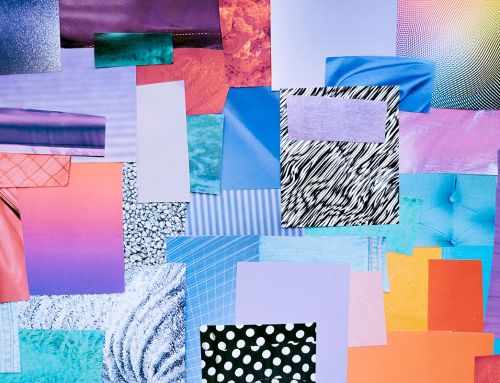
This past September, Pantone detailed a bright, uplifting palette of colors for summer 2019. The collection of bold, energetic hues were in line with the brightness we all associate with warm weather, vacations and time in the sun. So what happened?
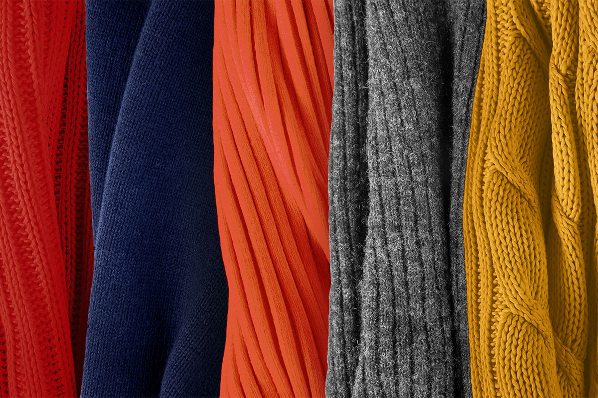
With the onset of spring/summer fashion these past few months, the pervading colors have not been the bright, saturated tones of the Pantone report, but rather charcoal gray and dark navy accented by small pops of deep color. Somber, rich shades of olive, gold, orange and dark red — traditionally autumn colors — seem to be upstaging the brighter, friendlier colors in the palette.
I also can’t help but notice that the usually breezy, organic summer florals I so love have been replaced by ridged and structured patterns that bring to mind austere Victorian wallpaper patterns. Are these formal aesthetics and stern colors a reflection on the negativity of our current political state? Is summer becoming a more gloomy season because those sweltering days remind us of the horrors of global warming? Or is this just the fashion industry breaking the mold for a more unexpected season?
I’m anxiously watching to see if other areas of design follow suit, dialing back color in favor of a more somber, structured aesthetic. Looking at current interior design fads like gray walls, subway tile and concrete furnishings, I can’t help but think there’s a trend in that direction.