Redesigning your website can be a daunting task — from organization and design to copywriting and web development. Our creative process puts the content first, ensuring that sites are as user-friendly and informative as they are beautiful (we recently applied this approach to our Vehr site, and we’re thrilled to share the results here).
If you’re considering redesigning your own site, here are a few recommendations to help you improve your user experience:
Conduct research to determine your approach.
What is wrong with your current site? Can you fix these issues with updates to the existing site, or does it require a complete redesign? To answer these questions, interview key stakeholders and collect feedback from your audience. Generate a master list of concerns, prioritizing any items that have been documented by multiple people. These are the issues you most need to resolve.
Discuss the results of your research with both your designer and web developer. Whether your concerns are technical or visual, this team can help you ascertain the depth of the issues and how extensive your changes will need to be to resolve them. Some changes may only require a refresh or update to a few pages; deeper issues may demand a complete redesign and rebuild of the site.
Organize the content before worrying about the aesthetics.
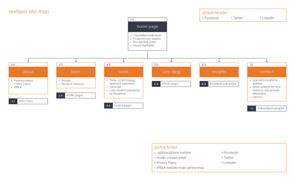
Create a site map of your existing website to evaluate your organization. Does your site have a clear hierarchy? Are you relying on visitors to click through multiple pages to get all the information? Consider the feedback from your research, and use it to update your site map for a better user experience. Think about how you can streamline your content and lead visitors through the site organically. Keep in mind that your audience will decrease with each click.
Here’s an example of Vehr’s recently revised site map:

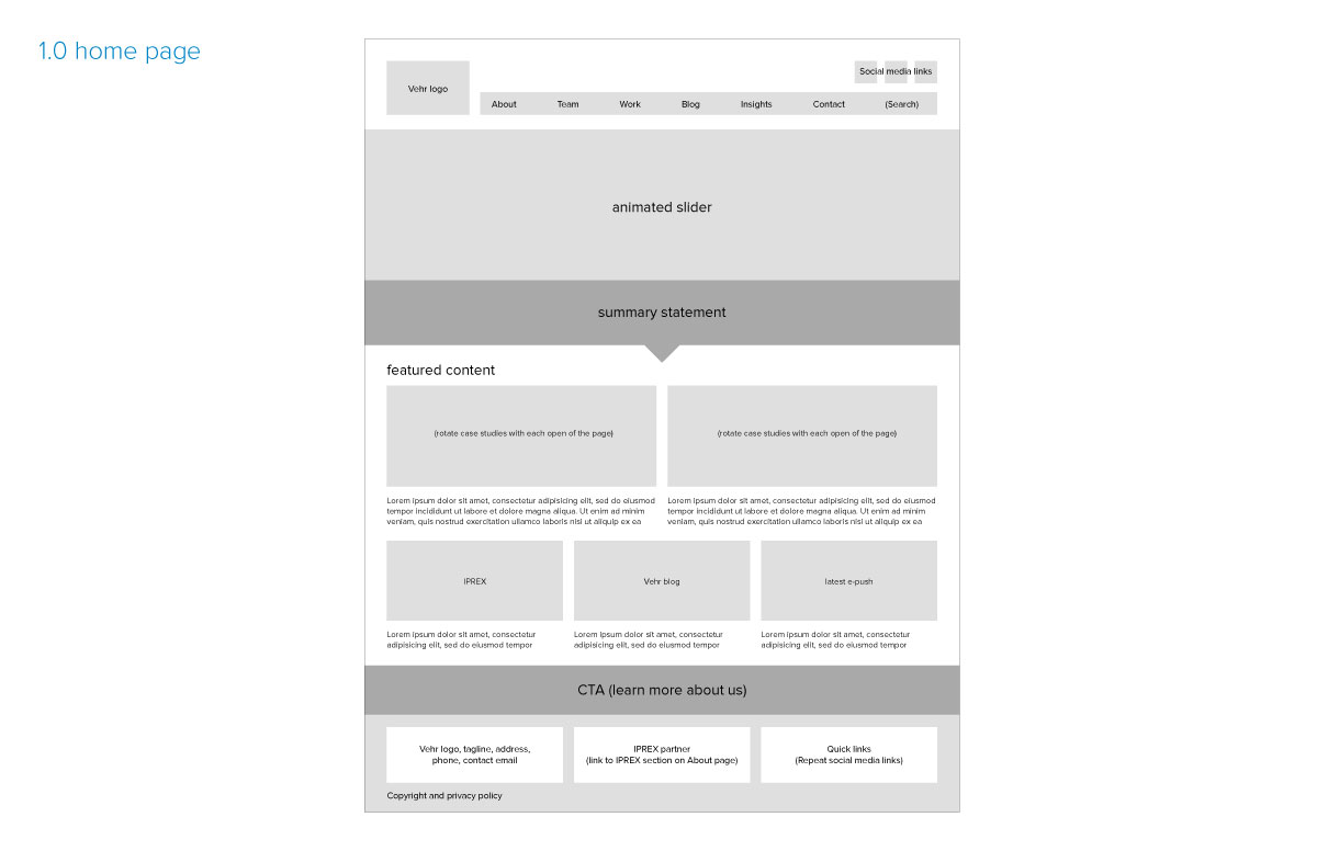
Once your revised site map is finalized, have your creative team create wireframes for each page of the site before developing the visuals. Wireframes will dictate the grid, placement and proportions for your site. They reflect the functionality of site elements, but do not contain actual copy or images. At this stage, the focus should still be on the hierarchy of content. Pictures will be represented by simple boxes and copy by dummy text. Continue to evaluate your layouts based on your research, from the perspective of your audience to determine the most effective page structures.
A wireframe for Vehr’s home page:

Optimize your site for different screen sizes.
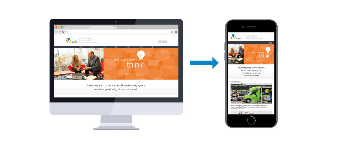
As you begin to develop designs for the site, don’t forget to consider how the site will translate to smart phones and tablets. In most cases, you can deliver the best user experience by developing a responsive site which adapts the formatting based on the width of the browser window. With a responsive site, multi-column text could stack into a single column on narrower screens; a navigation toolbar may collapse into a menu button; header images could crop to a different proportion or drop out on smaller devices. Once a design direction has been established, be sure to look at page layouts in both desktop and mobile views to ensure that your system works across the board.

Work with your developer to ensure the back end of your site is as user-friendly as the front end.
The platform on which your website is built is just as important as how it looks. WordPress sites, for instance, can be built with an approachable back end featuring built-in templates and styles that are easy to apply without any prior web experience. Do you want the ability to easily change content and add/delete pages on your own? If there are issues with your site later on, will your developer be readily available to support you? Be sure to address these issues up front so that your website can be kept up-to-date and relevant to your audience long after launch.
Test your site, and then test it again.
Once you feel comfortable with your site, share a review link with a group of stakeholders/audience members and ask them to note any concerns/problems they experience. Are there links that don’t work? Is there information they can’t find? If you’ve adequately addressed the issues documented from your research, feedback at this point should be mostly technical in nature. If larger concerns arise, work through them with your team. After revisions are made, test your site again to ensure you’ve solved the issues prior to launch.


