Hixson
Brand Refresh and Template Development
Hixson Architecture, Engineering and Interiors develops thoughtful, functional and attractive spaces for some of the best-known brands in the United States across its food & beverage, workplace, retail and R&D divisions. It prides itself on being an industry thought leader and produces high-value content — from newsletters to blogs to webinars. Through a comprehensive brand refresh, Vehr helped Hixson elevate its content to ensure that every element is as thoughtful, functional and attractive as the spaces it develops.
Vehr began the process by conducting a materials audit and, in collaboration with Hixson’s senior leaders and marketing team, evaluated the function, format and design of each piece to determine the types of collateral most needed and which pieces work best visually.
The company’s color palette didn’t reflect its inviting and innovative culture, and a lack of brand standards meant design elements were not consistently employed online and across collateral. In addition, as in many large organizations, different versions of key materials existed across personal desktops, making it difficult to manage the brand and keep content current.
Vehr created brand concepts that married favored elements of the existing Hixson brand with fresh design. With Hixson’s vibrant case study photography driving the new color palette, Vehr swapped out muted tones in favor of bright, energetic colors. New font choices give a nod to Hixson’s existing website typography as well as its logo. The company’s architectural work inspired both the typographic approach and materials layouts, which forge a series of “building blocks” to divide content.
Vehr’s insights gleaned from the materials audit also inspired the format and storytelling approach of the new Hixson collateral. Sensing that clients weren’t reading the lengthy case studies, Vehr sought to remedy this by developing a series of “building blocks” — mirroring the concept used for typography and layout — to make the content more readable by breaking it up into browsable formats. Since the sales team provides collateral to prospects collected in a single PDF, Vehr created templates with a flexible grid system that uses the same margins, text sizes and logo placement across collateral. This ensures that any combination of documents still feels like a unified piece.
The WIN
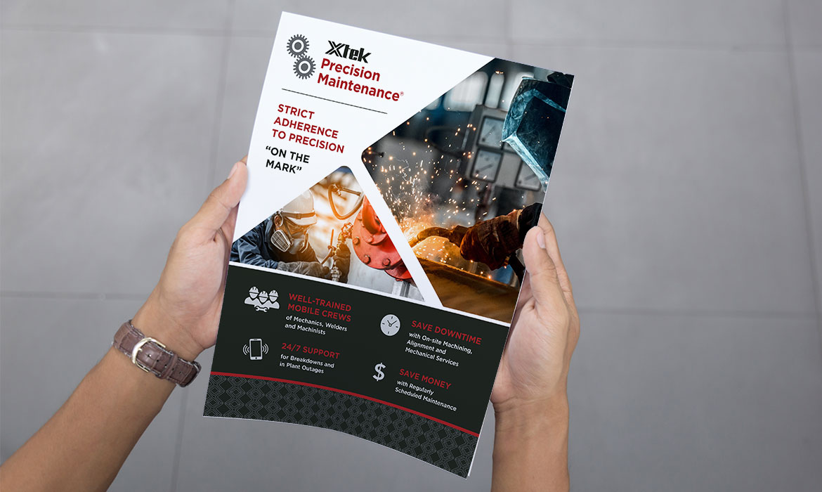
Vehr equipped Hixson with a contemporary, refreshed brand and the tools to create consistent, effective brand communications in-house. The company is now armed with new comprehensive brand guidelines that outline each element of the updated brand, along with a suite of design templates for newsletters, capability sheets, presentations, infographics, case studies and brochures. Every template is based on Hixson’s existing software and can be easily updated on demand.
